klink logo
K-link
klink logo
K-link
Build fully functional accessible web applications faster than ever – Klink UI includes more than 100 customizable components and 40 hooks to cover you in any situation
Klink UI based on Mantine
Free and open source
All packages have MIT license, you can use Klink UI in any project
TypeScript based
Build type safe applications, all components and hooks export types
Use anywhere
Klink UI supports all modern frameworks: Next.js, Remix, etc.
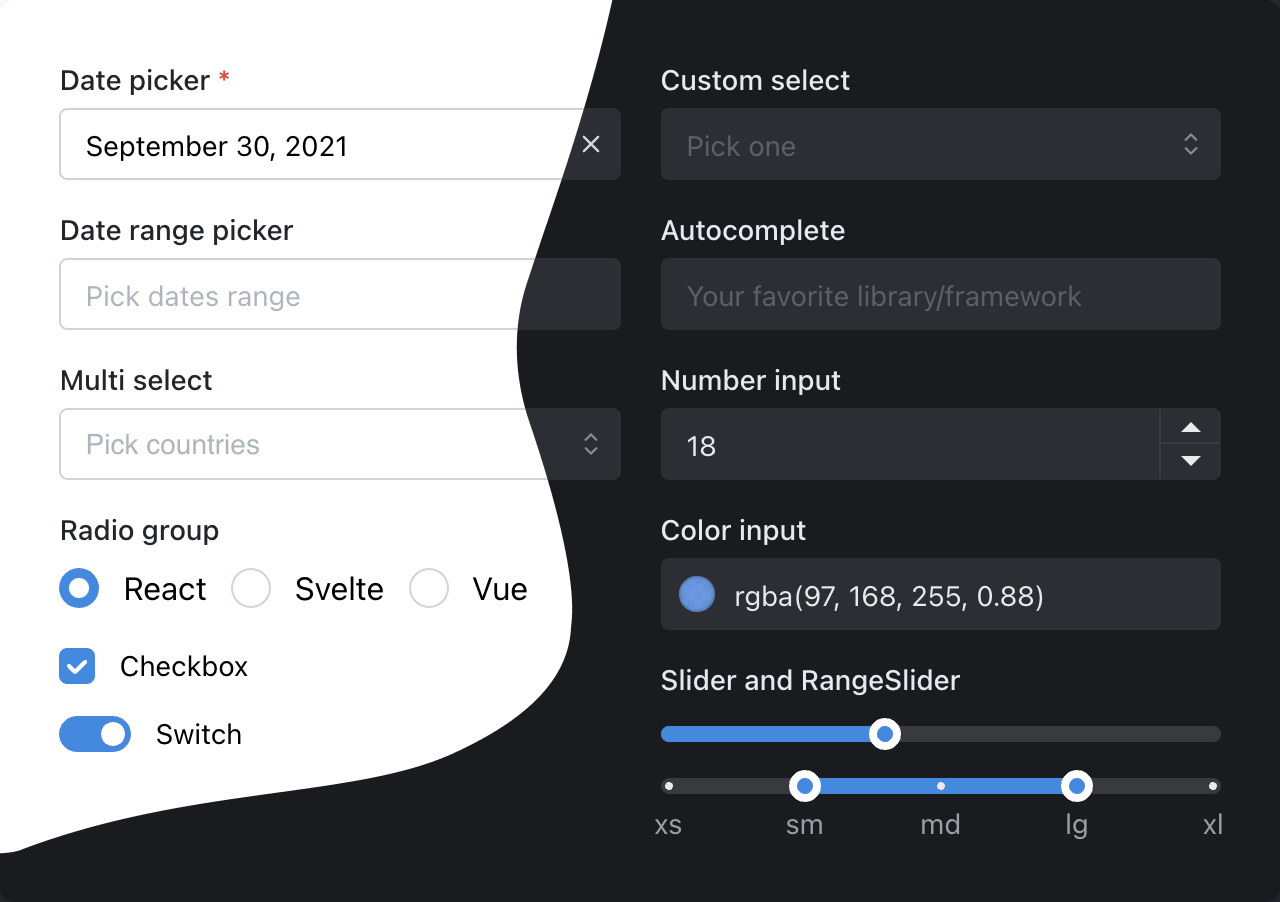
Get started
GitHub

100+ components

Every input can have description...
...and error

Dark color scheme

Add dark theme to your application with just a few lines of code – Klink UI exports global styles both for light and dark theme, all components support dark theme out of the box.
import { MantineProvider } from '@k-link/core';
function Demo() {
return (
<MantineProvider theme={{ colorScheme: 'light' }}>
<App />
</MantineProvider>
);
}

Customize components

Every Klink UI component supports visual customizations with props – you can quickly prototype and experiment by just modifying component props:
New branch
You've created new branch fix-notifications from master
2 hours ago
Commits
You've pushed 23 commits to fix-notifications branch
52 minutes ago
Pull request
You've submitted a pull request Fix incorrect notification message (#187)
34 minutes ago
Code review
Robert Gluesticker left a code review on your pull request
12 minutes ago
Color
Radius
xs
sm
md
lg
xl
2xl
Align
import { Timeline } from '@k-link/core';
function Demo() {
return (
<Timeline active={1}>
{/* items */}
</Timeline>
);
}

Styles overriding

Each Klink UI component supports styles overriding for every internal element inside with classes or inline styles. This feature alongside other customization options allows you to implement any visual modifications to components and adapt them to fit almost any design requirements.
Default slider styles
20%
50%
80%
<Slider defaultValue={40} marks={marks} />
Find elements that you need to change in styles API table
NameDescription
rootRoot element
trackTrack element, contains all other elements
barFilled part of the track
thumbMain control
draggingStyles added to thumb while dragging
labelLabel element, displayed above thumb
markWrapperWrapper around mark, contains mark and mark label
markMark displayed on the track
markFilledStyles added to mark when it is located in filled area
markLabelMark label, displayed below track
Then apply styles and add other props:
20%
50%
80%
function Demo() {
const styles = (theme) => ({
track: { '&::before': { backgroundColor: theme.colorScheme === 'dark' ? theme.colors.dark[3] : theme.colors.blue[1] } },
mark: { width: '0.375rem', height: '0.375rem', borderRadius: '0.375rem', transform: 'translateX(-0.1875rem) translateY(-0.125rem)', borderColor: theme.colorScheme === 'dark' ? theme.colors.dark[3] : theme.colors.blue[1] },
markFilled: { borderColor: theme.colors.blue[6] },
markLabel: { fontSize: theme.fontSizes.xs, marginBottom: '0.3125rem', marginTop: 0 },
thumb: { height: '1rem', width: '1rem', backgroundColor: theme.white, borderWidth: '0.0625rem', boxShadow: theme.shadows.sm },
});
return (
<Slider
defaultValue={40}
marks={marks}
labelTransition="fade"
size={2}
styles={styles}
/>
);
}
View more examples

Flexible theming

Extend default theme with any amount of additional colors, replace shadows, radius, spacing, fonts and many other properties to match your design requirements.
Bright pink badge
import { Badge, Button, MantineProvider } from '@k-link/core';
function Demo() {
return (
<MantineProvider theme={{
fontFamily: 'Greycliff CF, sans-serif',
colors: {
'ocean-blue': ['#7AD1DD', '#5FCCDB', '#44CADC', '#2AC9DE', '#1AC2D9', '#11B7CD', '#09ADC3', '#0E99AC', '#128797', '#147885'],
'bright-pink': ['#F0BBDD', '#ED9BCF', '#EC7CC3', '#ED5DB8', '#F13EAF', '#F71FA7', '#FF00A1', '#E00890', '#C50E82', '#AD1374'],
},
}}>
<Button color="ocean-blue">Ocean blue button</Button>
<Badge color="bright-pink" variant="filled">Bright pink badge</Badge>
</MantineProvider>
);
}

Based on emotion

Klink UI is based on emotion 👩‍🎤, take advantage of core emotion features: auto vendor-prefixing, critical css extraction during server side rendering, lazy evaluation, dynamic theming, type safe styles with TypeScript and more.
Add inline styles to any component with sx prop:
import { Text } from '@k-link/core';
function Demo() {
return (
<Text
sx={{
fontSize: '1.125rem',
'&:hover': {
backgroundColor: '#eee',
},
'@media (max-width: 47.1875em)': {
fontSize: '0.875rem',
},
}}
>
My custom text
</Text>
);
}
For more complex styles use createStyles function to separate styles from markup:
import { createStyles } from '@k-link/core';
const useStyles = createStyles({
parent: {
backgroundColor: 'pink',
'&:hover': {
backgroundColor: 'orange',
},
},
child: {
fontSize: '0.875rem',
lineHeight: 1.45,
},
active: {
backgroundColor: 'white',
},
});
function Demo() {
const { classes, cx } = useStyles();
return (
<div className={classes.parent}>
<div className={classes.child}>Child</div>
<div className={cx(classes.child, classes.active)}>Active child</div>
</div>
);
}
Subscribe to theme object in sx prop or createStyles function to use theme tokens in component styles:
import { Text } from '@k-link/core';
function Demo() {
return (
<Text
sx={(theme) => ({
backgroundColor: theme.colors.gray[0],
fontSize: theme.fontSizes.sm,
'@media (max-width: 47.1875em)': {
fontSize: theme.fontSizes.xs,
},
})}
>
My custom text
</Text>
);
}
You can use theme functions anywhere where Klink UI theme is available:
import { Text } from '@k-link/core';
function Demo() {
return (
<Text
sx={(theme) => ({
background: theme.fn.linearGradient(24, '#000', '#fff'),
[theme.fn.smallerThan('sm')]: {
color: theme.fn.rgba('#fff', 0.5),
},
})}
>
My custom text
</Text>
);
}
Add context styles with MantineProvider that will be applied to every component:
import { MantineProvider } from '@k-link/core';
function Demo() {
return (
<MantineProvider
theme={{
components: {
Button: {
styles: (theme) => ({
root: {
backgroundColor: theme.colors.indigo[7],
color: theme.white,
},
}),
},
TextInput: {
styles: (theme) => ({
label: {
color: theme.colors.gray[7],
fontSize: theme.fontSizes.xs,
textTransform: 'uppercase',
},
}),
},
},
}}
>
<App />
</MantineProvider>
);
}
Use styled components syntax with Klink UI theme and @emotion/styled:
import styled from '@emotion/styled';
const StyledComponent = styled.div`
text-align: center;
background-color: ${({ theme }) =>
theme.colorScheme === 'dark' ? theme.colors.dark[6] : theme.colors.gray[0]};
padding: 1.875rem;
border-radius: 0.3125rem;
cursor: pointer;
&:hover {
background-color: ${({ theme }) =>
theme.colorScheme === 'dark' ? theme.colors.dark[5] : theme.colors.gray[1]};
}
`;
function Demo() {
return <StyledComponent />;
}

Hooks library

Resize textarea by dragging its right bottom corner
Width: 0, height: 0
import { useElementSize } from '@k-link/hooks';
function Demo() {
const { ref, width, height } = useElementSize();
return (
<>
<textarea ref={ref} style={{ width: rem(400), height: rem(120) }} />
<div>Width: {width}, height: {height}</div>
</>
);
}
Build even faster with Klink UI

120+ responsive components
built with Klink UI

Build your next website even faster with premade responsive components designed and built by Klink UI maintainers and community. All components are free forever for everyone.
Explore components
View on GitHub

Ready to get started?

Klink UI works in all modern environments – get started instantly with Next.js, Gatsby.js, create-react-app, Vite or Remix by following getting started guide:
Next.js
Vite
Create React App
Remix
Gatsby

Join the community

Join Discord community
Ask questions, participate in new features discussions, see what people have built
Follow on Twitter
Get notified about new minor and major releases
Start a discussion
Request new features, ask questions and provide feedback with GitHub discussions
klink logo
K-link
Build fully functional accessible web applications faster than ever
About
ContributeAbout Klink UIChangelogReleases
Community
Chat on DiscordFollow on TwitterFollow on GithubGitHub discussions
Project
Klink UIDocumentationGithub organizationnpm organization
Built by Vitaly Rtishchev and these awesome people
Join Discord community
Follow Klink UI on Twitter